如何更改 CheckboxListTile 高度?
[英]How to change CheckboxListTile height?
問題描述
很快,我需要可選區域在高度方面更小。
文本和復選框大小很好,但周圍的框對於我嘗試創建的清單來說太大了。
嘗試用 Transform.scale 包裝它,但文本變得太小:
Transform.scale(
  scale: 0.8,
  child: CheckboxListTile(
    title: const Text("Rinite alérgica"),
    value: timeDilation != 1.0,
    controlAffinity: ListTileControlAffinity.leading,
    onChanged: (bool value) {
      setState(() {
      timeDilation = value ? 2.0 : 1.0;
      });
    },
  ),
),
嘗試用 Container 包裝它,但我在屏幕上收到溢出警告。
有沒有人有更好的解決方案?
2 個解決方案
解決方案1
0 2020-08-31 04:21:43
你有沒有嘗試過 ?
SizedBox(
  height: 50,
  width: 50,
  child: ......
)
解決方案2
0 2021-06-16 12:50:31
當嘗試調整CheckboxListFile大小時,似乎 Google 實際上建議創建自定義 Tile 小部件並使用Checkbox小部件。
https://api.flutter.dev/flutter/material/CheckboxListTile-class.html#material.CheckboxListTile.3
查看已創建的 LabeledCheckbox 小部件。 您可以非常輕松地修改所有組件以滿足您的需要。 例如,如果您希望 Widget 本身更小,您現在可以將其包裝在一個 Container 中
/// Flutter code sample for CheckboxListTile
// 
//
// Here is an example of a custom LabeledCheckbox widget, but you can easily
// make your own configurable widget.
import 'package:flutter/material.dart';
void main() => runApp(const MyApp());
/// This is the main application widget.
class MyApp extends StatelessWidget {
const MyApp({Key? key}) : super(key: key);
static const String _title = 'Flutter Code Sample';
@override
Widget build(BuildContext context) {
return MaterialApp(
title: _title,
home: Scaffold(
appBar: AppBar(title: const Text(_title)),
body: const Center(
child: MyStatefulWidget(),
),
),
);
}
}
class LabeledCheckbox extends StatelessWidget {
const LabeledCheckbox({
Key key,
@required this.label,
@required this.padding,
@required this.value,
@required this.onChanged,
}) : super(key: key);
final String label;
final EdgeInsets padding;
final bool value;
final Function onChanged;
@override
Widget build(BuildContext context) {
return InkWell(
onTap: () {
onChanged(!value);
},
child: Container(
padding: padding,
child: Row(
children: <Widget>[
Expanded(child: Text(label)),
Checkbox(
value: value,
onChanged: (bool newValue) {
onChanged(newValue);
},
),
],
),
),
);
}
}
/// This is the stateful widget that the main application instantiates.
class MyStatefulWidget extends StatefulWidget {
const MyStatefulWidget({Key? key}) : super(key: key);
@override
State<MyStatefulWidget> createState() => _MyStatefulWidgetState();
}
/// This is the private State class that goes with MyStatefulWidget.
class _MyStatefulWidgetState extends State<MyStatefulWidget> {
bool _isSelected = false;
@override
Widget build(BuildContext context) {
return LabeledCheckbox(
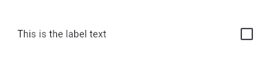
label: 'This is the label text',
padding: const EdgeInsets.symmetric(horizontal: 20.0),
value: _isSelected,
onChanged: (bool newValue) {
setState(() {
_isSelected = newValue;
});
},
);
}
}
 如何在flutter中更改checkBoxListTile內的復選框顏色?
[英]How to change the checkBox color inside the checkBoxListTile in flutter?
如何在特定事件后更改 CheckboxListTile 的標題?
[英]How do I change a CheckboxListTile's title after a specific event?
如何在 flutter 的 alertDialog 中使用 checkboxlisttile?
[英]How can I use checkboxlisttile in alertDialog in flutter?
如何在 Flutter 的 CheckboxListTile 中使 Checkbox 形狀圓潤?
[英]How to make Checkbox shape rounded in CheckboxListTile in Flutter?
聲明:本站的技術帖子網頁,遵循CC BY-SA 4.0協議,如果您需要轉載,請注明本站網址或者原文地址。任何問題請咨詢:yoyou2525@163.com.
相關問題
如何更改 CheckBoxListTile 中的值項?
Flutter - 如何更改 CheckboxListTile 大小?
如何在flutter中更改checkBoxListTile內的復選框顏色?
如何更改 CheckboxListTile 的刻度顏色
如何在特定事件后更改 CheckboxListTile 的標題?
如何在 flutter 中生成 CheckboxListTile
如何在flutter中保存checkboxListTile
如何使用 checkboxListTile 設置所選項目的值
如何在 flutter 的 alertDialog 中使用 checkboxlisttile?
如何在 Flutter 的 CheckboxListTile 中使 Checkbox 形狀圓潤?
相關標簽