How to change CheckboxListTile height?
Question
Shortly, I need the selectable area to be smaller in terms of height.
Text and Checkbox sizes are good, but the surrounding box is too big for the checklist I'm trying to create.
CheckBoxListTile current height vs. desired height
Tried wrapping it with Transform.scale but text becomes too small:
Transform.scale(
  scale: 0.8,
  child: CheckboxListTile(
    title: const Text("Rinite alérgica"),
    value: timeDilation != 1.0,
    controlAffinity: ListTileControlAffinity.leading,
    onChanged: (bool value) {
      setState(() {
      timeDilation = value ? 2.0 : 1.0;
      });
    },
  ),
),
Tried wrapping it with Container, but I get on-screen overflow warnings.
Does anyone have a better solution?
2 answers
solution1
0 2020-08-31 04:21:43
Have you tried ?
SizedBox(
  height: 50,
  width: 50,
  child: ......
)
solution2
0 2021-06-16 12:50:31
When trying to resize the CheckboxListFile it seems that Google actually recommends creating a custom Tile widget and making use of the Checkbox widget.
https://api.flutter.dev/flutter/material/CheckboxListTile-class.html#material.CheckboxListTile.3
Look at the LabeledCheckbox widget that's been created. You can very easily modify all components to fit your needs. For example, if you wished to make the Widget itself smaller, you can now wrap it in a Container
/// Flutter code sample for CheckboxListTile
// 
//
// Here is an example of a custom LabeledCheckbox widget, but you can easily
// make your own configurable widget.
import 'package:flutter/material.dart';
void main() => runApp(const MyApp());
/// This is the main application widget.
class MyApp extends StatelessWidget {
const MyApp({Key? key}) : super(key: key);
static const String _title = 'Flutter Code Sample';
@override
Widget build(BuildContext context) {
return MaterialApp(
title: _title,
home: Scaffold(
appBar: AppBar(title: const Text(_title)),
body: const Center(
child: MyStatefulWidget(),
),
),
);
}
}
class LabeledCheckbox extends StatelessWidget {
const LabeledCheckbox({
Key key,
@required this.label,
@required this.padding,
@required this.value,
@required this.onChanged,
}) : super(key: key);
final String label;
final EdgeInsets padding;
final bool value;
final Function onChanged;
@override
Widget build(BuildContext context) {
return InkWell(
onTap: () {
onChanged(!value);
},
child: Container(
padding: padding,
child: Row(
children: <Widget>[
Expanded(child: Text(label)),
Checkbox(
value: value,
onChanged: (bool newValue) {
onChanged(newValue);
},
),
],
),
),
);
}
}
/// This is the stateful widget that the main application instantiates.
class MyStatefulWidget extends StatefulWidget {
const MyStatefulWidget({Key? key}) : super(key: key);
@override
State<MyStatefulWidget> createState() => _MyStatefulWidgetState();
}
/// This is the private State class that goes with MyStatefulWidget.
class _MyStatefulWidgetState extends State<MyStatefulWidget> {
bool _isSelected = false;
@override
Widget build(BuildContext context) {
return LabeledCheckbox(
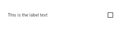
label: 'This is the label text',
padding: const EdgeInsets.symmetric(horizontal: 20.0),
value: _isSelected,
onChanged: (bool newValue) {
setState(() {
_isSelected = newValue;
});
},
);
}
}
The technical post webpages of this site follow the CC BY-SA 4.0 protocol. If you need to reprint, please indicate the site URL or the original address.Any question please contact:yoyou2525@163.com.